SmartFrame’s Themes are optimized for smartphones and tablets, and their functionality adapts to the requirements of touchscreen-enabled devices.
Here are some differences you can expect when looking at your Themes on mobile devices:
Theme elements
Depending on the display size, Theme elements will appear slightly denser. Regardless of the style selected in the Design section, this ensures an optimal experience on smaller displays and prevents buttons and/or the Caption from covering the embedded image.
Tap to display
Elements that are only displayed on desktop devices on mouseover become visible when a viewer taps on the SmartFrame on a touchscreen-equipped smartphone or tablet.
Full-screen functionality
Full-screen functionality is not available on smartphones and tablets. Instead, SmartFrame images can be displayed in a full-window mode, which fills the current browsing window’s dimensions with the image.
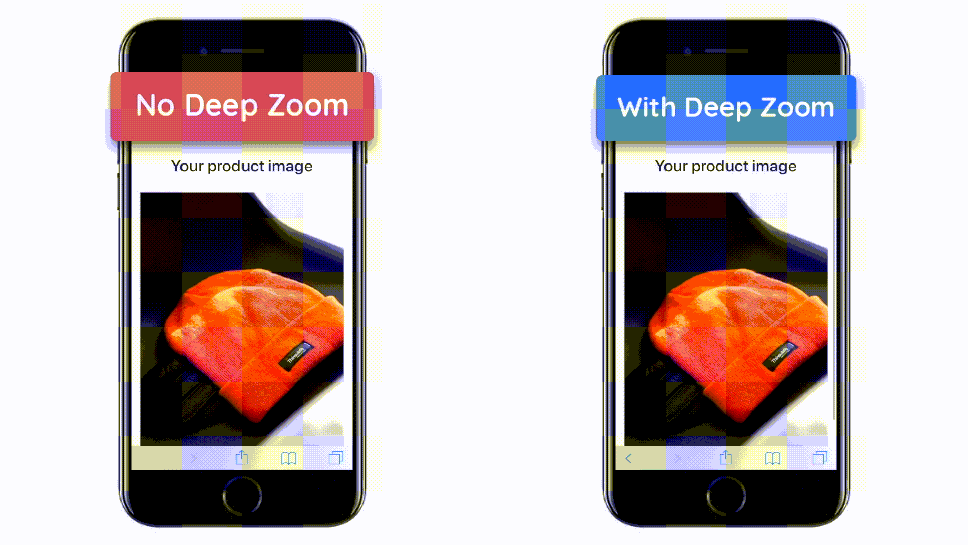
Hyper Zoom
Hyper Zoom works differently on all touch devices, but the principle is the same wherever it’s used: to zoom into the image with a pinch gesture, right up to its maximum resolution. What makes Hyper Zoom really stand out is the fact that, with each pinch, the image is rendered in a higher resolution, which means that the quality remains intact.